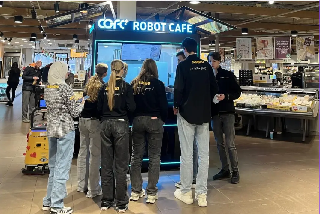
The Rise of Professional Robotic Café Technology: What COFE+ Is and Why It Matters
TL;DR — COFE+ is a fully automated robotic coffee kiosk that grinds fresh beans, brews espresso and lattes, creates latt……

Robot coffee kiosk signage placement is not a decorative afterthought; it is the primary interface between an unmanned machine and a paying customer. When you remove baristas, you remove the only staff who could answer questions, direct movement, and suggest purchases. Every sign must take on that role. From our global deployments across more than 35 countries, poor signage consistently causes more lost revenue than any mechanical issue, because it creates hesitation exactly when a person decides whether to walk up or walk past.
In a manned café, a barista greets, explains the menu, organizes the queue, and rescues a confused customer. A robot coffee kiosk strips all of that away. The only remaining staff member is the signage system. If a sign is missing, badly placed, or unclear, the customer stands there uncertain and usually leaves. Operators routinely invest in advanced machinery and then overlook the simple signs that convert foot traffic into sales.
Signage here is functional communication, not branding. Every sign must answer a specific, unspoken question: what is this machine, how do I order, where do I wait, where do I collect. A robot coffee kiosk like the COFE+ 7th generation handles the brew autonomously, but it cannot call out to a passerby. That job belongs entirely to well-placed signs.
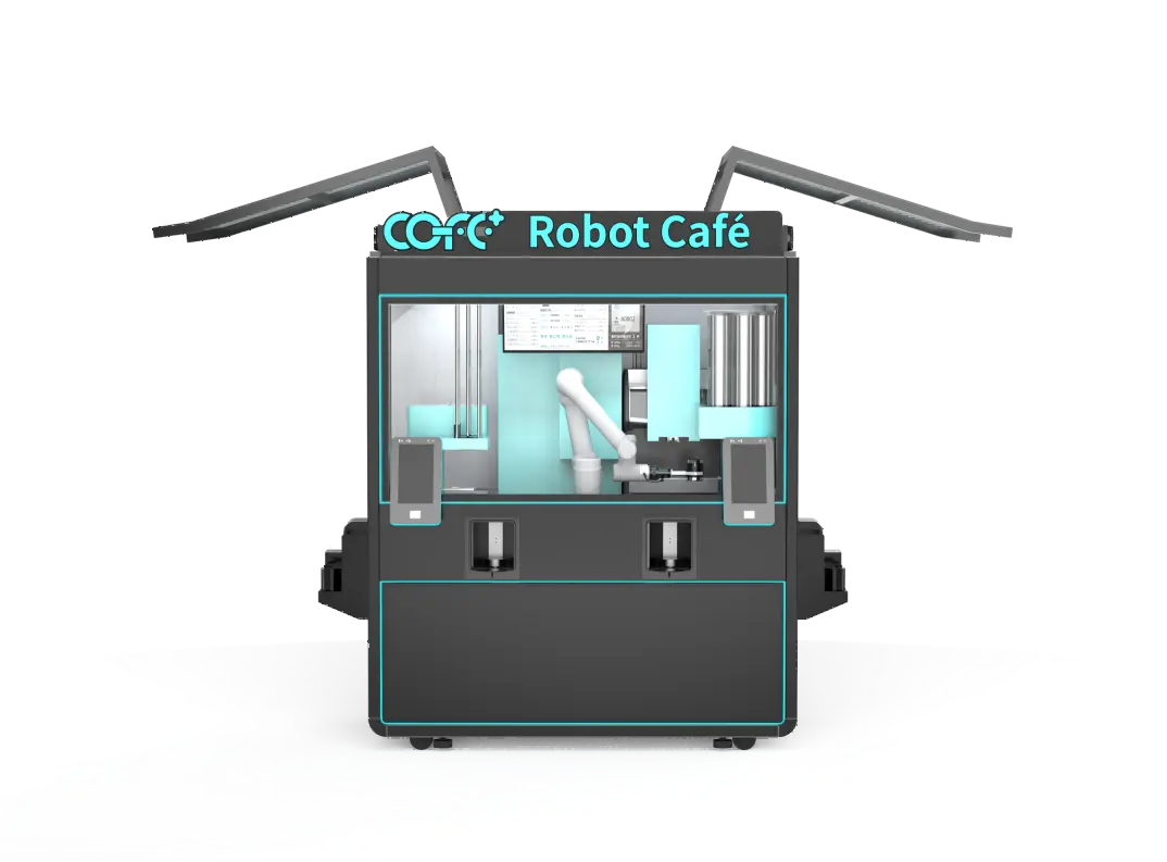
A customer moves through five distinct stages at a robot coffee kiosk, and signage must serve each one without a person to fill the gaps.
| Stage | Customer Question | Signage Type | Placement |
|---|---|---|---|
| Attraction | What is that? Can I get coffee? | Directional banners, hanging signs, sidewalk signs | 5–15 meters ahead, along sight lines |
| Approach | How does it work? Is it easy? | Instructional decals, “Tap to Start” stickers | Arm’s length, near the screen |
| Ordering | What can I get? How much? | Menu board above the machine, screen prompts | Eye-level, 0.5–1 meter |
| Waiting | Where do I stand? How long? | Wait-zone floor markings, countdown display | Adjacent to the machine, never blocking |
| Pickup | Is this mine? Where do I reach? | Lit pickup zone, “Order Ready” label | Directly at the dispensing area |
These stages are not abstract. At high-traffic transit hubs where we operate, missing even one of these signs creates bottlenecks and abandoned sessions. The flow breaks the moment a customer cannot answer their own question within three seconds.
The first ten meters determine whether someone approaches. External signage must capture attention, identify what is on offer, and make the machine feel approachable. We use overhead banners, floor graphics, and portable A‑frame signs depending on the venue. In an indoor shopping mall, a hanging sign visible from both sides of the corridor converts casual strollers into checkers. At outdoor sites, a sturdy sidewalk sign with the coffee menu and a QR code for pre‑ordering works reliably.
Position external signs along natural walking paths, not necessarily dead‑center in front of the kiosk. A sign set eight meters before the machine on the approach side catches people who have not yet seen it. In several deployments we added a simple arrow with “Fresh Coffee Here” and a cup icon, and walk‑up traffic rose noticeably. The sign answers “what is that thing over there?” before the customer walks past.
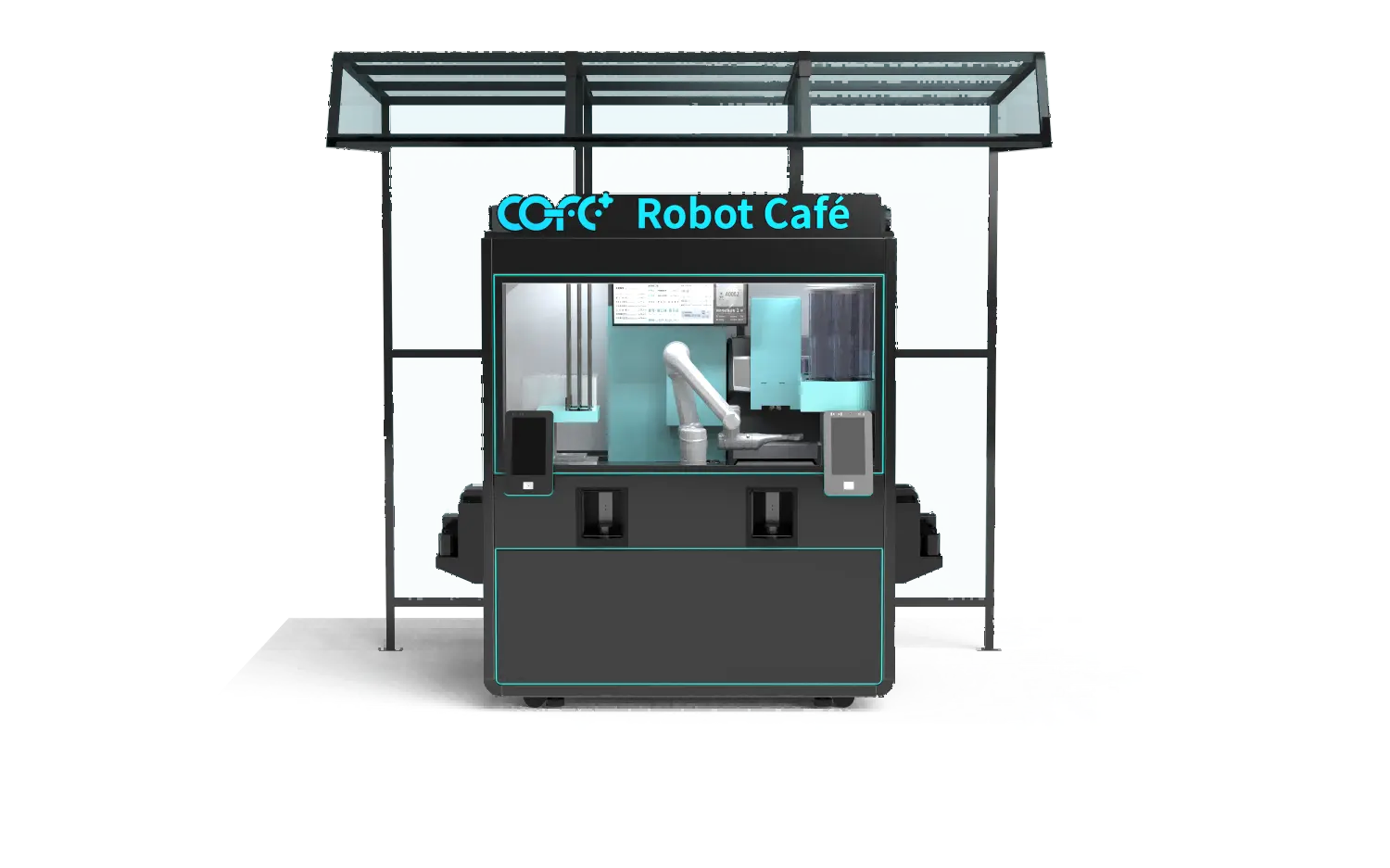
Once a customer stands at the kiosk, they are in the order zone. This is where many unmanned setups lose people. The touchscreen on the COFE+ kiosk is intuitive, offering over 300 drinks with visual customization, but a first‑time user benefits from static reinforcement. We recommend placing a step‑by‑step decal near the screen: “1. Touch to begin, 2. Choose your drink, 3. Customize and confirm, 4. Pay, 5. Collect.” It cuts hesitation.
A high‑contrast menu board above the kiosk serves two roles: it pulls distant customers and lets the immediate user see options without scrolling. Show the top‑selling drinks and prices. If the kiosk accepts multiple payment methods, display those logos clearly. A customer who cannot confirm their payment method is accepted will walk.
If you are designing signage for multiple robot coffee kiosk sites with different traffic patterns, modeling the customer flow first saves reprinting and confusion. Reach out to our strategy team at sales@hi-dolphin.com to discuss site‑specific signage layout before you commit to print.
The final seconds of a transaction are often wasted. After a drink is dispensed, customers naturally glance around. That is the moment for a small sign near the pickup area: “Order again from your phone next time” with a QR code, or “Try the seasonal latte” with a picture. No barista is there to prompt an add‑on, so signage must carry the suggestion.
Equally important is a clearly marked pickup zone. A lit shelf or labeled cupholder area tells people exactly where to reach. We have seen that a simple “Your Drink” sign with an arrow stops people from peering into the machine or missing their order. It closes the loop and builds the kind of reliability that makes a one‑time buyer a regular.
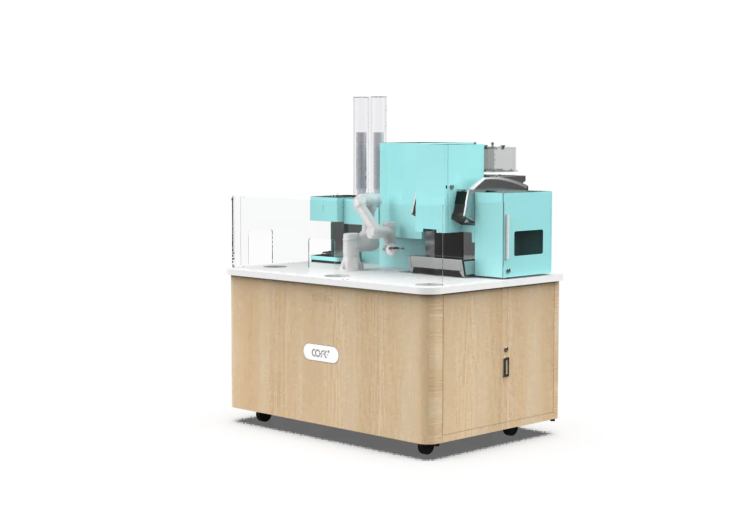
Digital screens can promote drinks and take orders, but static signs still hold a place. A digital display is visible only at close range, while a bold physical sign catches the eye from across a room. The strongest approach layers both: a large static menu board for distant visibility, and the touchscreen for ordering. The kiosk’s own digital content cannot solve the initial attraction problem.
The exact distance depends on ceiling height, sight lines, and ambient clutter. In open‑plan spaces, a hanging sign at three meters, visible from twenty meters, works well. In a narrow hallway, closer placement becomes necessary. The goal is to catch attention before the person reaches the machine, not after they have already decided to pass.
The core principles of visibility and clarity apply to both, but the materials and mounting methods differ significantly. Outdoor signs need matte finishes, UV‑resistant inks, and sturdy frames. Indoor signs can use lighter materials yet require careful alignment with mall or lobby design. In either case, the sign should not clash with the kiosk’s own branding or create visual chaos.
Seasonal promotions, wear, and changes in the surrounding environment all reduce effectiveness over time. If your remote monitoring shows a rising number of abandoned sessions, that is often a direct cue that instruction signage needs a refresh. Send photos of your site layout and traffic patterns to sales@hi-dolphin.com, and we will share an audit of where the flow is breaking.
Many robot coffee kiosk operators discover that adjusting signage brings a measurable sales lift within weeks. If your unmanned coffee sites are seeing lower‑than‑expected throughput, the issue is rarely the machine itself. It is usually the messages around it. For a conversation about your specific flow and signage strategy, contact us at sales@hi-dolphin.com or call +86 131 6630 1290. Share your location type and customer volume, and we will work with you to map the signs that make the difference.
TL;DR — COFE+ is a fully automated robotic coffee kiosk that grinds fresh beans, brews espresso and lattes, creates latt……
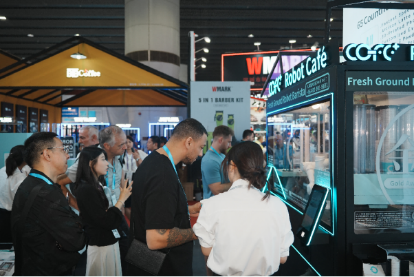
7th-Genertion Smart Robot Coffee Kiosk Arrives at the Belt and Road Core Hub, Ushering in a New Service Era Along t……
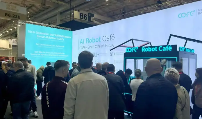
CHICAGO, May 12, 2026 (GLOBE NEWSWIRE) – Shanghai Hi-Dolphin Robot Technology today announced the U.S. debut of its 7th‑……